5 Ways to Visualize Text Data
This short blog post will show five ways to visualize text-based data. For our example, I will use the “SMS Spam Collection” Data Set. It is a set of SMS messages categorized as either spam or ham, as well as the messages themselves. By exploring these visualization techniques, we'll uncover how transforming text into visual data can reveal some insights, offering a quick understanding of patterns within this dataset.
Imports and Setup
For building my visualization pipeline, I’m using Python and Jupyter Notebook. We’ll start by loading the main NLP library:
import nltk
nltk.download('punkt')
nltk.download('stopwords')
nltk.download('wordnet')
nltk.download('vader_lexicon')
We’ll use some helper libraries, visualization and scientific packages as usual suspects, with various configuration options for our environment.
I want to plot my charts inline in the Jupyter Notebook, so I call %matplotlib inline. I want to enhance the resolution of our plots, making them crisper and more readable, particularly on Retina displays, thus I need %config InlineBackend.figure_format.
# Helper libraries
import warnings
import re
from pathlib import Path

# Scientific and visual libraries
import numpy as np
import pandas as pd
import matplotlib.pyplot as plt
import seaborn as sns
import plotly as px
import plotly.graph_objs as go
import networkx as nx
from nltk.probability import FreqDist
from nltk.sentiment.vader import SentimentIntensityAnalyzer
from nltk.tokenize import word_tokenize
from nltk.corpus import stopwords
from nltk.stem.wordnet import WordNetLemmatizer
from wordcloud import WordCloud
from wordcloud import STOPWORDS
from sklearn.feature_extraction.text import TfidfVectorizer
from sklearn.decomposition import PCA

%matplotlib inline
%config InlineBackend.figure_format = 'retina'

# Various settings
warnings.filterwarnings("ignore")
np.set_printoptions(precision=4)
sns.set_theme()
pd.set_option("display.max_rows", 120)
pd.set_option("display.max_colwidth", 40)
pd.set_option("display.precision", 4)
pd.set_option("display.max_columns", None)
Getting the Data
Let us download the public dataset from Kaggle and put it into a dedicated directory (in my case I have named it data) where our notebook lives. We need to take care of encoding since it uses Windows latin-1:
fname = "spam.csv"
root_path = Path.cwd()
data_path = root_path / "data"
raw_data = data_path / source_fname
encoding = "cp1252"
Then we can import it:
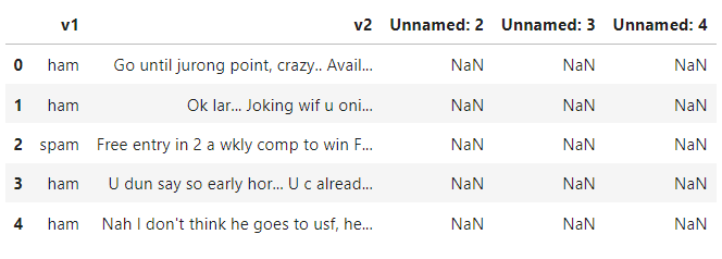
data = pd.read_csv(raw_data, encoding=encoding)
data.head()
Preparing the Corpus
Not everything in the raw data is useful or perfect. We must make some adjustments.
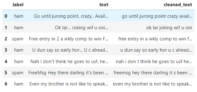
First we will extract only relevant columns, and rename them right away:
corpus = data[["v1","v2"]]
corpus.columns = ["label","text"]
In order to visualize well the documents, we must preprocess the corpus to make it more clean.
Basic Text Cleaning
Here we will focus solely on decapitalization, stripping, and roughly ignoring non alphabetic symbol for reasons of simplicity.
Creating a function for this purpose is simple:
def filter_text_noise(text):
    """Removes noise from text."""
    new_text = text
    for char in new_text:
        if not char.isalpha():
            new_text = new_text.replace(char, " ")
    cleaned_text = re.sub(r'\s+', ' ', new_text)
    return cleaned_text.strip().lower()
Now we can apply it easily with Pandas on the text corpus. We create another variable for that:
corpus["cleaned_text"] = corpus.text.apply(lambda t: filter_text_noise(t))
corpus.head(7)
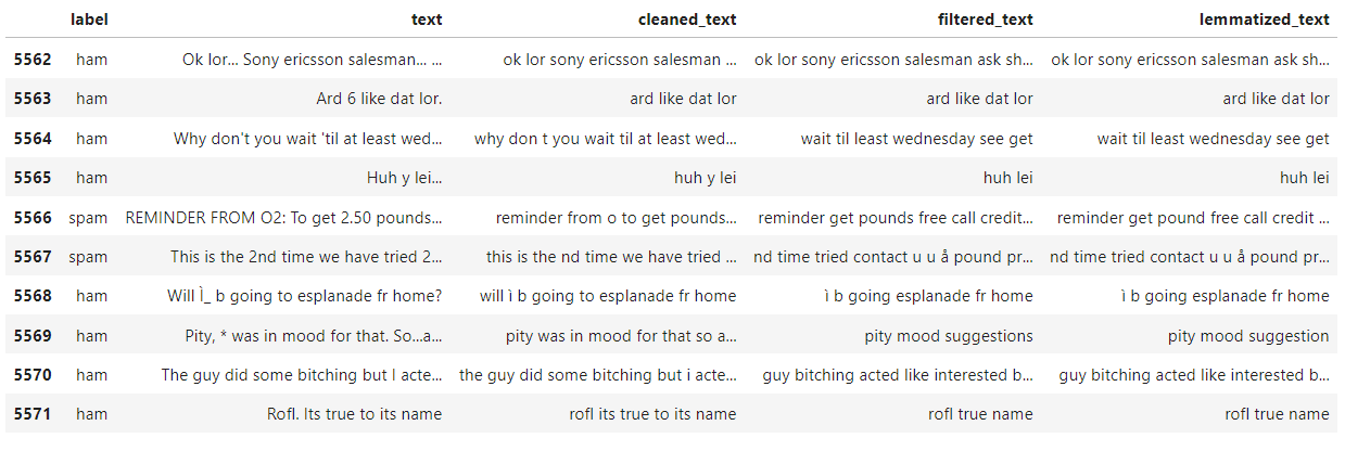
Stopword Filtering
Eliminating stopwords is beneficial in text analysis, as numerous words hold minimal semantic meaning. For that we need before to tokenize the text. My function looks like this:
def filter_stopwords(text):
    """Removes stopwords from text."""
    stop_words = set(stopwords.words("english"))
    tokenized_text = word_tokenize(text)
    filtered_text = []
    for token in tokenized_text:
        if token not in stop_words:
            filtered_text.append(token)
    return " ".join(filtered_text)
It's time to apply it:
corpus["filtered_text"] = corpus.cleaned_text.apply(lambda t: filter_stopwords(t))
Text Lemmatization
This technique reduces words to their base or root forms called lemma. The main goal is to treat different forms of a word as the same unique word to elimiate noise or unnecessary elements in analysis.
def lemmatize_text(text):
    lemmatizer = WordNetLemmatizer()
    tokenized_text = word_tokenize(text)
    return " ".join([lemmatizer.lemmatize(w) for w in tokenized_text])

corpus["lemmatized_text"] = corpus.filtered_text.apply(lambda t: lemmatize_text(t))
corpus.tail(10)
Visualizing The Corpus
Now, we can start the fun part of the visualization pipeline: building charts. To effectively plot text data, the key approach is to convert the text into either discrete or continuous variables. Then, we choose charts that best match the nature of these variables.
Word Frequency Plot
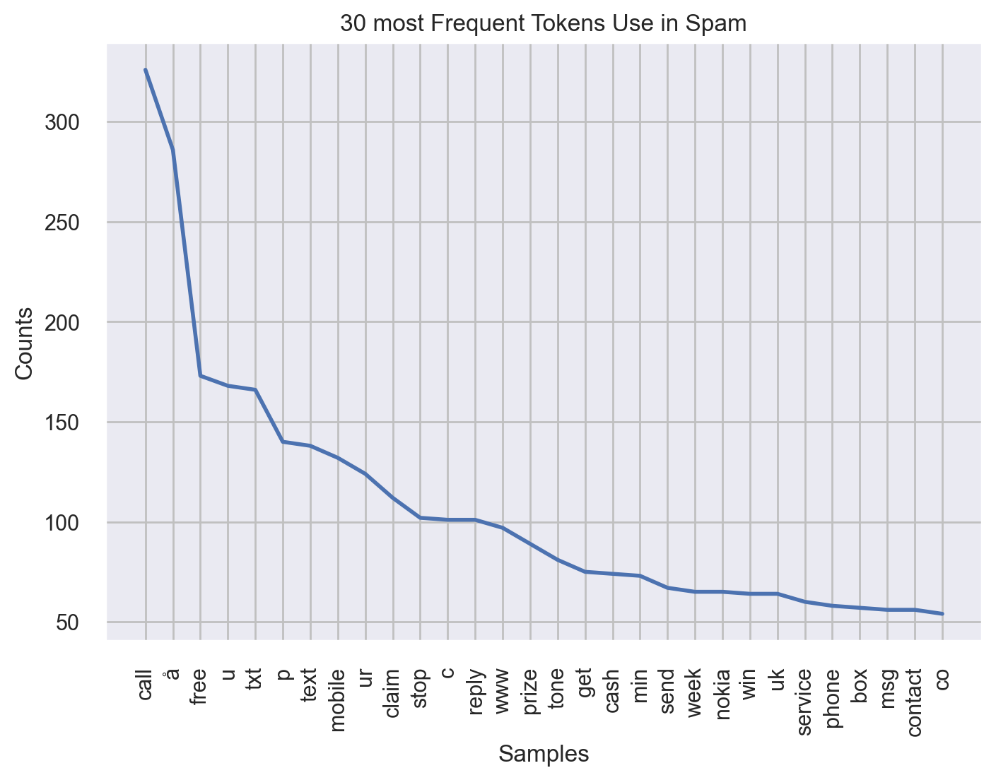
It's a kind of distribution plot for words. The goal is to easily grasp which words dominate the text. What is even more practical is to use this plot in a differential manner. So I will display the frequencies for spams and hams separately.
For this we will create 2 sets:
all_words_spam = "".join([doc for doc in corpus[corpus.label=="spam"].lemmatized_text])
all_words_ham = "".join([doc for doc in corpus[corpus.label=="ham"].lemmatized_text])
Now NLTK can do the trick. We will look at the 30 most frequent words used for spam group:
fdist = FreqDist(all_words_spam.split())
fdist.plot(30, title="30 most Frequent Tokens Use in Spam")
plt.show()
Now for ham group:
fdist = FreqDist(all_words_ham.split())
fdist.plot(30, title="30 most Frequent Tokens Use in Ham")
plt.show()
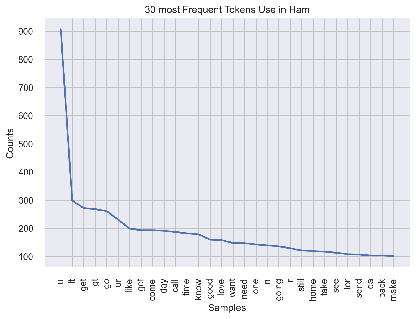
We can see a clear difference in distribution of spam and han messages.
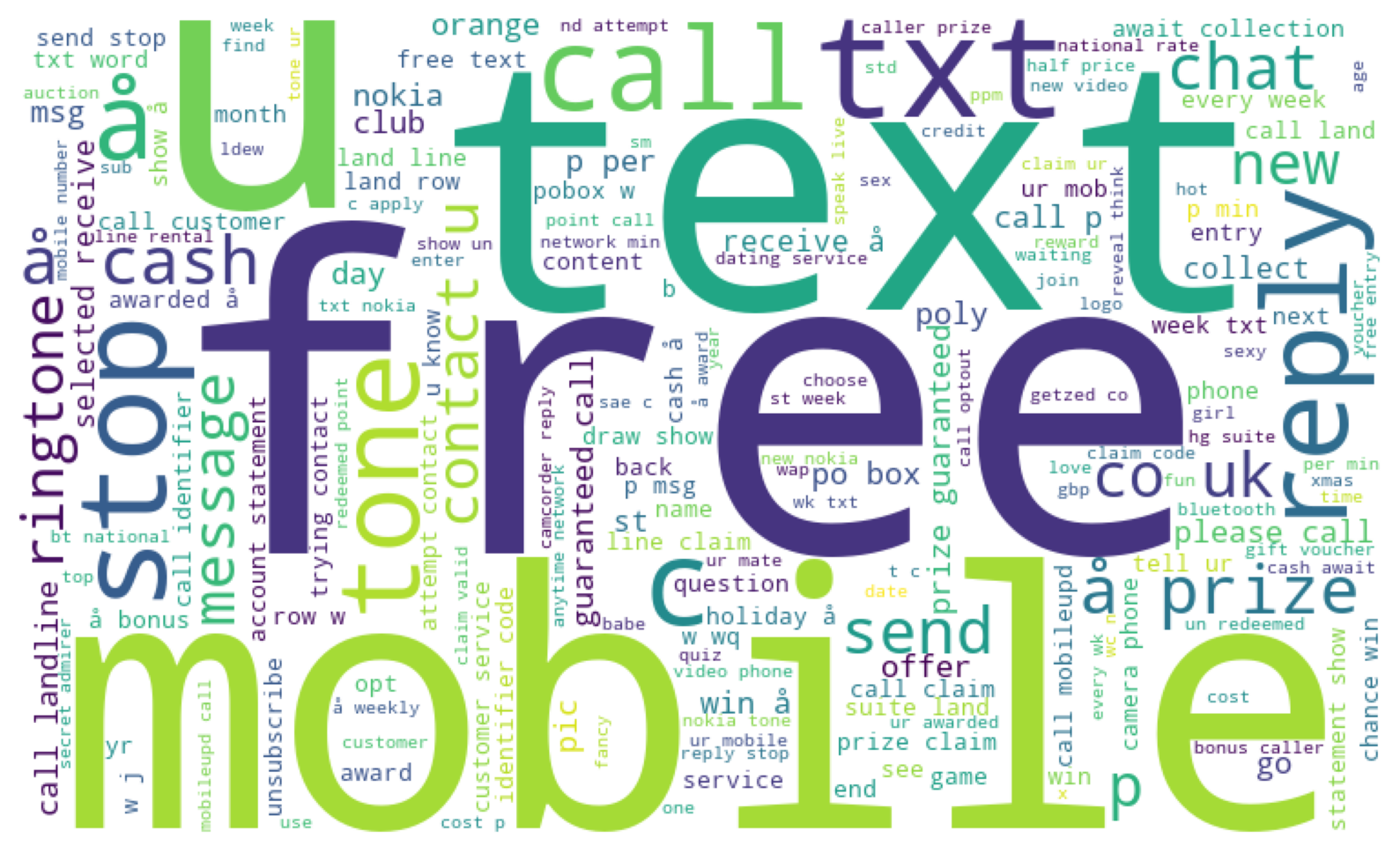
Word Cloud
The principle of word cloud is the same as frequency distribution. It counts how many times each word appears in the text, then displays these words in a visual or artistic format. It is highly customizable and can exclude another set of common stopwords.
Again we perform differential analysis. Let's start with Spams:
# Spam data
stopword_list = set(STOPWORDS)

word_cloud = WordCloud(
    width=750,
    height=450,
    background_color="white",
    stopwords=stopword_list,
    min_font_size=10,
).generate(all_words_spam)

plt.figure(figsize=(10, 8))
plt.imshow(word_cloud)
plt.axis("off")
plt.show()
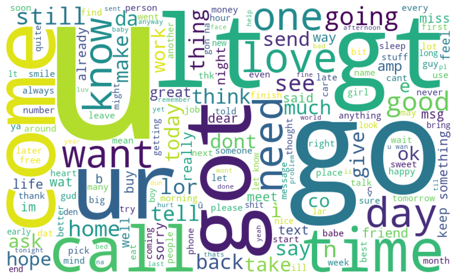
Now in Hams:
# Ham data
word_cloud = WordCloud(
    width=750,
    height=450,
    background_color="white",
    stopwords=stopword_list,
    min_font_size=10,
).generate(all_words_ham)

plt.figure(figsize=(10, 8))
plt.imshow(word_cloud)
plt.axis("off")
plt.show()
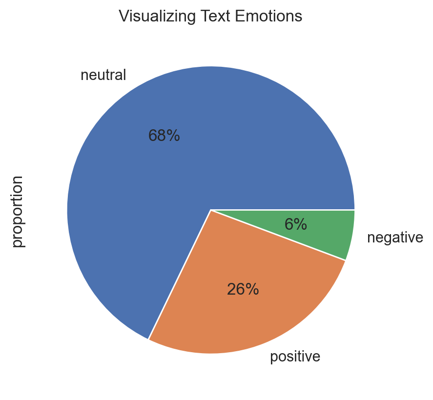
Pie Chart of Sentiments
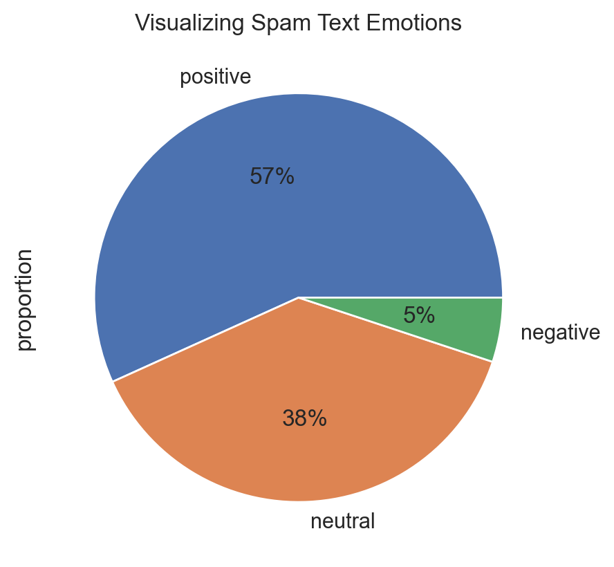
One fun task is to visualize sentiment of documents in a corpus. Analyzing the sentiment of the messages can also be insightful since Spam messages often exhibit a strong positive sentiment to provoke an emotional response. For that we will use an unsupervised method called VADER. It's a part of the NLTK and helps programs to understand human emotions expressed in text. It comes with a pre-built model, so you don't have to train it with your own data. Finally since it can handle raw and informal text without much preprocessing, we don't have to feed it with lemmatized version of the corpus.
First we will craft a function for sentiment extraction:
def get_sentiment(text=""):
sent_classifier = SentimentIntensityAnalyzer()
score = sent_classifier.polarity_scores(text)["compound"]
if 0.5 < score:
return "positive"
if -0.5 <= score <= 0.5:
return "neutral"
return "negative"
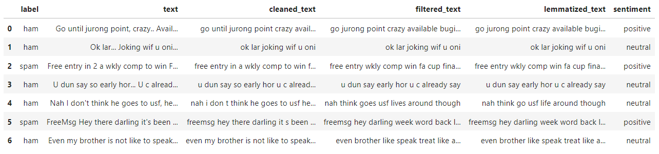
corpus["sentiment"] = corpus.text.apply(lambda t: get_sentiment(t))
corpus.head(7)
Now let's display overall opinions in the corpus, then by group:
plt.title("Visualizing Text Emotions")
(corpus["sentiment"]
    .value_counts(normalize=True)
    .plot
    .pie(autopct="%1.0f%%")
)
plt.show()
But things start being interesting when we segment groups:
plt.title("Visualizing Spam Text Emotions")
(corpus[corpus.label=="spam"]
    .sentiment
    .value_counts(normalize=True)
    .plot
    .pie(autopct="%1.0f%%")
)
plt.show()
plt.title("Visualizing Ham Text Emotions")
(corpus[corpus.label=="ham"]
    .sentiment
    .value_counts(normalize=True)
    .plot
    .pie(autopct="%1.0f%%")
)
plt.show()
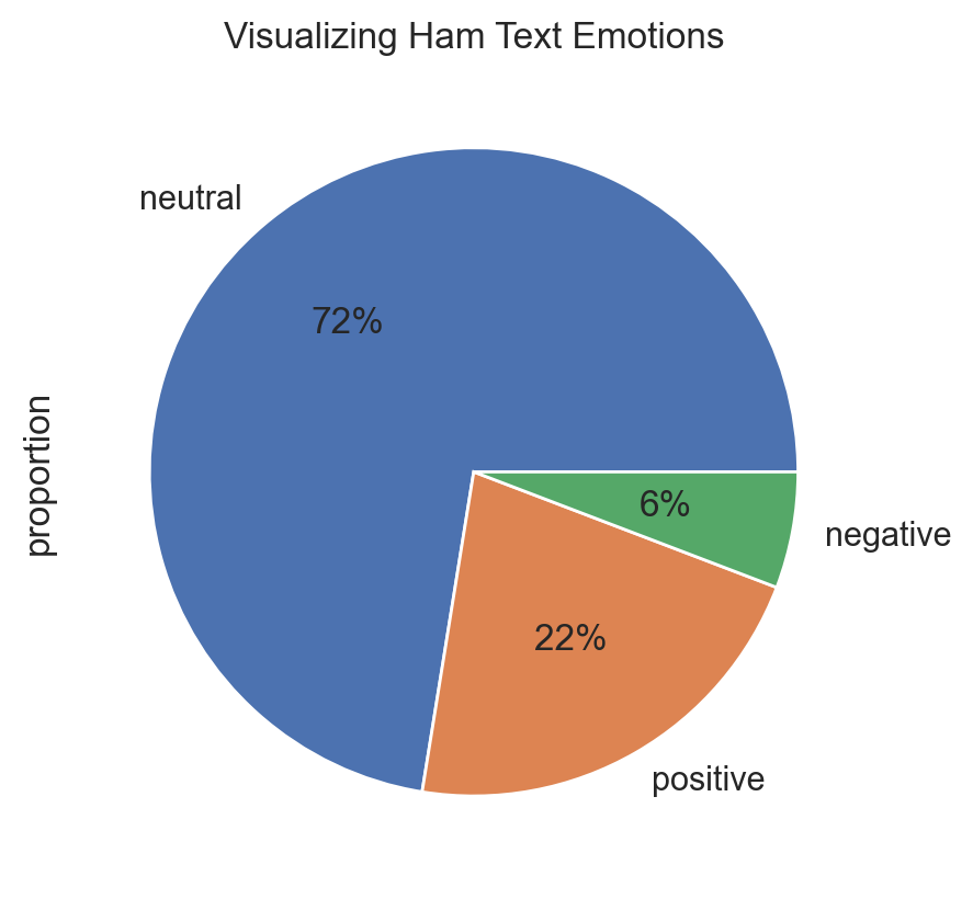
The conlusion here is that Spam messages often use excessively positive or attractive language, but it's not a definitive and general indicator. We can't conclude anything in absolute terms in this process because we never really know the big picture, but this way is a good starting point to investigate the context of the corpus.
Graph of Word Networks
Another method to display text data is to find relationships in graphs as sets of words. It's a way to plot semantic groupings of words. Thus text network can be built in a way that retains the narrative and, therefore, provides more accurate information about the text and its topical structure.
For that we will create a function that creates edges from preprocessed text, then build and plot the network graph:
def create_network_graph(prep_text):
    def create_edges(word_list, window_size=2):
        edges = []
        for i in range(len(word_list)):
            for j in range(i+1, min(i+window_size+1, len(word_list))):
                edges.append((word_list[i], word_list[j]))
        return edges
    edges = create_edges(prep_text)

    G = nx.Graph()
    G.add_edges_from(edges)

    plt.figure(figsize=(12, 12))
    nx.draw(G, with_labels=True, node_color='skyblue', node_size=1500, edge_color='gray')
    plt.title("Word Relationship Network Graph")
    plt.show()
We will build an example with the Spam group corpus that are positive sentiment, and select a sample of it.
sample = corpus.sample(frac=0.02, random_state=9)
positive_spam_filter = (sample.label=="spam") & (sample.sentiment=="positive")
positive_spam_words = "".join([doc for doc in sample[positive_spam_filter].filtered_text])
create_network_graph(positive_spam_words.split())
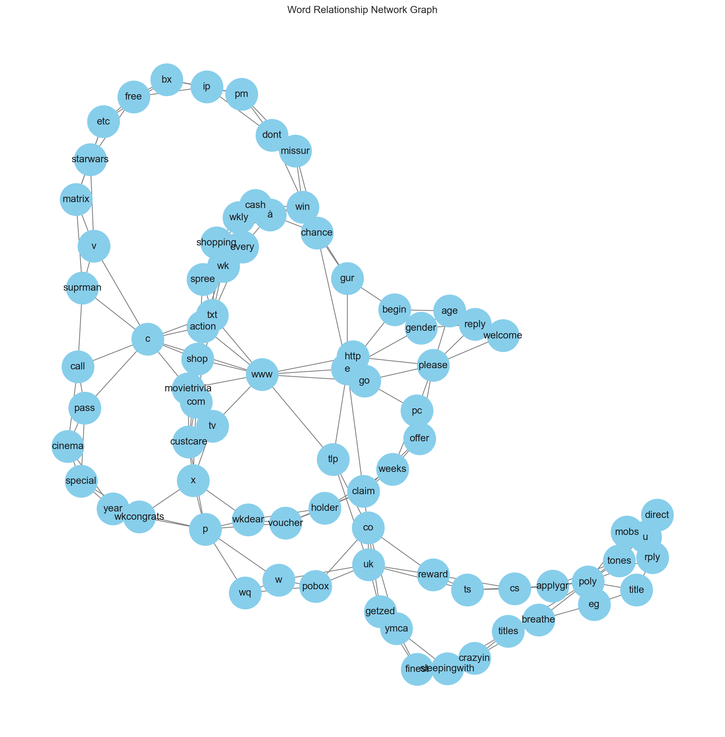
Now it's easy to see the connections between words and themes to uncover relationships that are significant into this particular sample. We can see for instance that spam messages tend to often include URLs or prompts to external content, and there are keywords that are commonly used in spam messages, such as "congrats", "free", "change", etc.
3D Scatterplot
Here we will need some feature engineering before building any plot. The goal is to plot 3-dimensional scatterplot from spam/ham class, by transforming non-tabular data into a vector space representation. For that we will transform the text corpus into a matrix of TF-IDF features. However, due to the inevitable increase in dimensionality, we will apply PCA to reduce the feature space to an optimal number of components.
Let's create our TF-IDF matrix and principal components:
tfidfvectorizer = TfidfVectorizer(analyzer='word', stop_words='english')
tfidf_corpus = tfidfvectorizer.fit_transform(corpus.lemmatized_text)

pca = PCA(n_components=3, random_state=42)
df_pca = pd.DataFrame(
    data=pca.fit_transform(tfidf_corpus.toarray()),
    columns=[f"term_{n}" for n in range(pca.n_components_)]
)
Now we can merge label vector with PCA matrix:
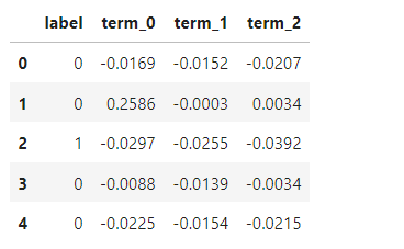
final_df = pd.concat([corpus["label"], df_pca], axis=1)
final_df.head()
PCA helps in visualizing high-dimensional data in a more comprehensible 3D scatter plot. Now we will use plotly for its interactive capabilities, allowing us to create dynamic 3D visualizations.
This following code implements the 3D Scatterplot which use the 3 principal components as continuous dimensions, and SMS label as color dimension:
trace1 = go.Scatter3d(
    x=final_df['term_0'],
    y=final_df['term_1'],
    z=final_df['term_2'],
    mode='markers',
    marker=dict(
        color= final_df.label,
        size= 20,
        line=dict(
            color=final_df.label,
            width=12
        ),
        opacity=0.8
    )
)
data = [trace1]
layout = go.Layout(
    title={
        'text': 'Message Class',
        'y':0.9,
        'x':0.5,
        'xanchor': 'center',
        'yanchor': 'top'
    },
    margin=dict(l=0, r=0, b=0, t=0),
    scene=dict(
        xaxis=dict(title='term_0', backgroundcolor="rgb(200, 200, 230)"),
        yaxis=dict(title='term_1', backgroundcolor="rgb(230, 200,230)"),
        zaxis=dict(title='term_2', backgroundcolor="rgb(230, 230,200)")
    )
)

fig = go.Figure(data=data, layout=layout)
fig.update_layout(scene_aspectmode='cube')
px.offline.iplot(fig)
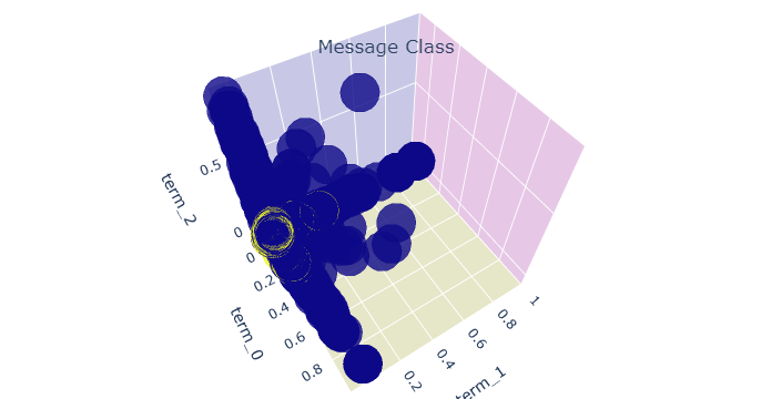
Now we can reveal where the Spam cluster (displayed in yellow circle) appears in the PCA values.